


Purist Street Photographers want go get composition right when they shoot and reject cropping in post production…but why not? Continue reading after the jump….
I shot this image while strolling through Genoa’s historic Old Town during my recent vacation in Italy. Below is the original photograph. I was carrying my Olympus PEN-F with my Oly mZuiko 14-150mm F4.0-5.6 Travel Zoom attached. When entering Piazza San Lorenzo in front of the Duomo San Lorenzo (a magnificent medieval cathedral by the way) this smiling girl with ice cream in one hand and her mobile phone in the other immediately caught my eye. I loved the vibrance of her smile that radiated summer fun. So I brought the camera to my eye, Zoom already at the far end at 150mm which equals to 300mm equivalent in full frame, and pressed the shutter. It was a more or less automatic move. A split second later the moment would have been lost.
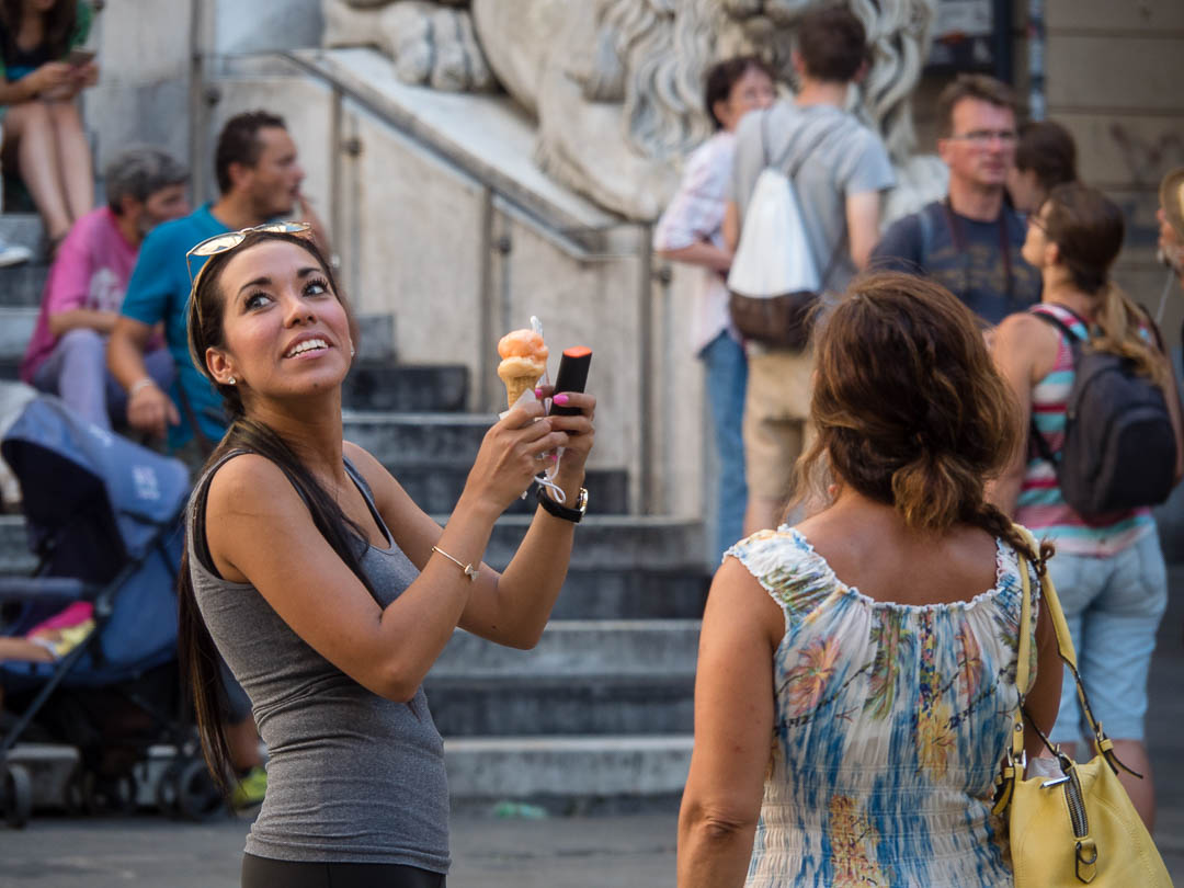

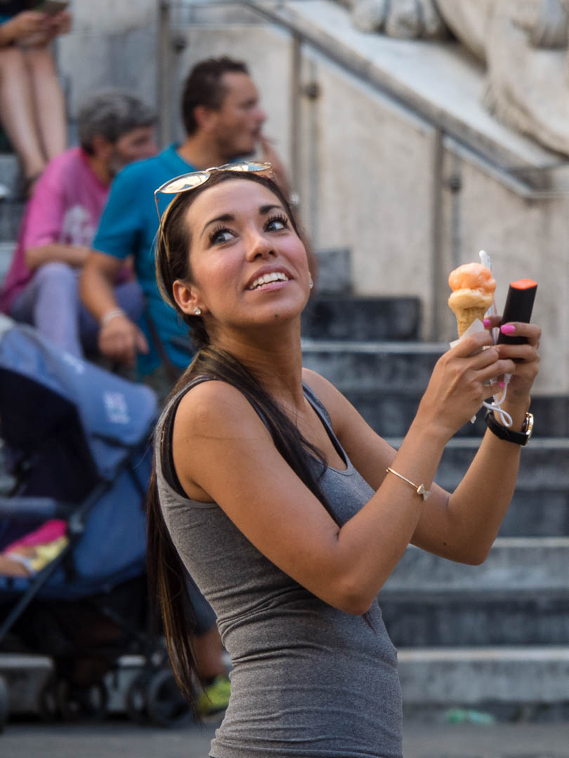
When looking at the image in Lightroom I immediately liked it. The girl with the summer smile was a keeper. But when looking at it in more detail I thought the right side of the image contains too much clutter that I somehow found distracting. So I went for a crop, isolating the girl and converting the image from landscape to portrait orientation. The result you find below. I could have cropped tighter put I like the kind of juxtaposition of her head looking up and the blurred heads of the two other tourists looking right. That way I think also her gaze towards the upper left corner has more room, emphasizing the question at what she is looking at.
Even if I would have shot the original image in portrait orientation, it would have had too much empty space around the girl anyway as I was already at the far end of my zoom range and if I would have continued to walk towards the scene the moment would have been lost.
As you probably know, I shoot a lot of my Street Photographs either directly in Black&White or convert them to monochrome in Lightroom CC, at least those where the colors in the image don’t contribute to the story of the photograph, which in this case I don’t think is the case, although you might argue that the tones of her suntanned skin add to the summer feeling. Below you find the two versions side by side. In my opinion in the B&W version she pops out much more than in the color image, especially her eyes. And I feel it gives the image a more timeless feeling. But of course this is just my opinion. I would love what you think about those conversions, first cropping and then monochrome conversion. You have all images here in this post. Feel free to comment!
Related Posts:
Little woes of a traveling photographer
Are you a Hunter or a Gatherer ?
When you know you got a winner
Gear & Camera Settings for Street Photography