
Anyone playing with monochrome conversions in post-processing knows the pondering question: B&W or color? Like I did when looking at this shot of Ascensore Spianata Castelletto, one of the elevators that connect the base of Genoa‘s old town with the higher quarters. From the terrace next to the elevator you have a splendid view across the medieval old town out to the harbor and the Mediterranean beyond. I decided I like the monochrome version better. I think it better fits the elegance of the art deco elevator house. What do you think? Check out the color version after the jump…
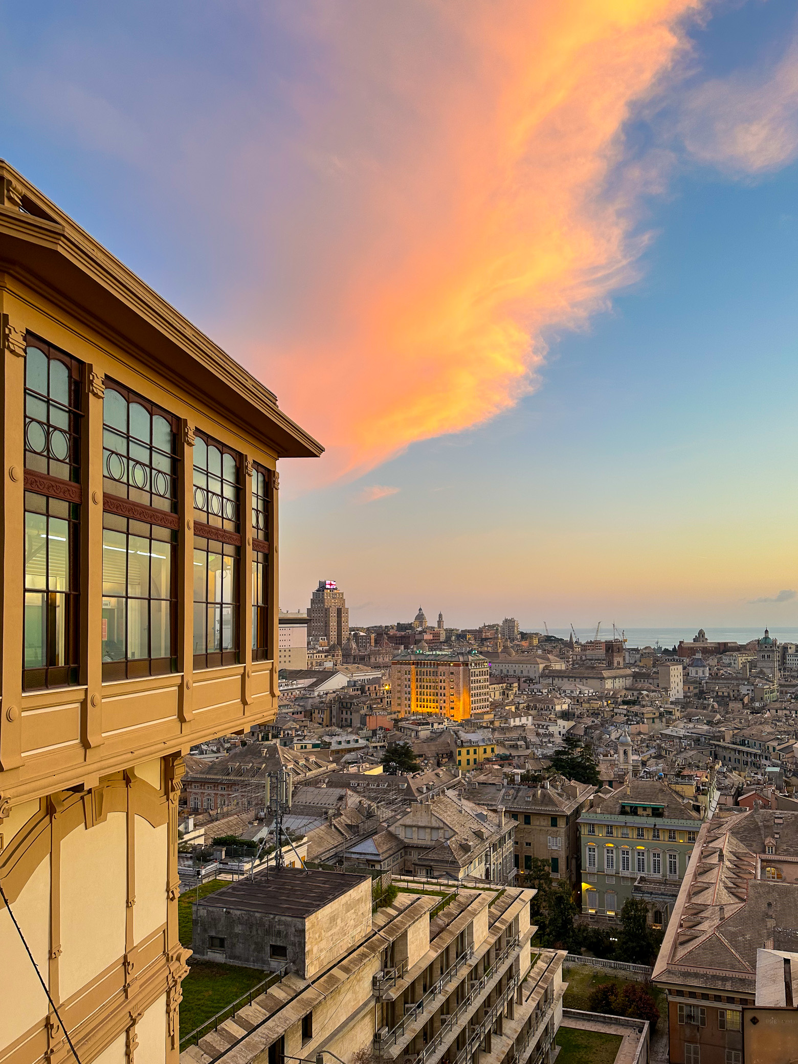
Well, here is the colored version. What do you think? Look for photographs of yourself that you could imagine look well in monochrome, then convert them. And then decide: B&W or Color?
The image was taken with my iPhone 14 Pro and post-processed (incl. B&W conversion) in Lightroom Classic.
If you are looking for tips and inspirations around street photography you can find in my free Learning center.
Have a great Friday
Marcus
Related Posts:
I like b/w photography a lot, but in this case I think colour. The cloud, the light in the building, the colour version just seems more vibrant and lively.
Thanks, Jill, I really appreciate your opinion. Marcus
Color! But there is a time and place for B & W. So on this one I vote both.
Thanks, Loralei, your visit and comment is very much appreciated. Hope all is well! Marcus
I think my vote for this goes to colour. The lighting on the buildings is perfect and you just can’t recreate that with the B and W.
Thanks, Linda, for sharing your opinion, so much appreciated! Have a good week! Marcus
I love the comparison, and I honestly can’t decide which I prefer! Thank you for sharing as always, Marcus!
Thanks, Cate, appreciate your visit and comment, as always! Have a great week! Marcus
Definitely the B&W although I do confess to a preference for the crisp elegance they provide!
Thanks, Julie, for sharing your opinion, so much appreciated! And I agree, a good B&W image has an elegance that’s hard to achieve in color….
I vote for the BW, but maybe with a bit more contrast? 😊 The color version is really all about that building in the middle, and of course the cloud. This exercise is a good example of how to emphasize the subject you were looking at when you snapped, versus what you discover when you look later.
Thanks for sharing your thoughts, David, so much appreciated! I played with more contrast, but found that then I would have lost the details in the little buildings below…so decided against…
Color. The B&W is lifeless.
Thanks for weighing in, Steven, very much appreciated. Happy Sunday! Marcus
Color. It keeps the balance of the composition tight.
Thanks for sharing your “vote” and the reasoning for it, so much appreciated! Marcus
Color!
Thanks, Marland, for casting your vote 😉 Happy Sunday! Marcus
You’re welcome!
Color. The shot is about the cloud and it’s reflection on the building in the middle. And the cloud is special because of it’s color. In the B&W it looses it’s ‘glory’; and the building looks a bit strange ‘lit from below’, because the connection with the cloud is not clear anymore without the color.
Thanks so much for sharing your opinion, Harrie, and the reasoning behind. Highly appreciated! Have a great Sunday! Marcus
Difficult choice… both are excellent.. but my vote goes for color 🙂
Thanks so much for sharing your vote, Agata, this is highly appreciated! Marcus
I love the color one but the B&W looks mysterious ☺️
Thanks so much Ribana for taking the time to visit and comment, highly appreciated! Happy Sunday! Marcus
I agree with you, Marcus. Even though I like both, I prefer the b&w. 😊
Thanks for casting your vote, Pepper, so much appreciated! Marcus
You have got the cloud just right.
Thanks for visiting and your kind words, Sisman, very much appreciated! Marcus
I prefer the B&W version, Marcus, it fits the old buildings and architecture better. 👍🏻
Thanks, John, for sharing your opinion and reasoning, much appreciated! Have a great Sunday! Marcus
You too, Marcus. 👍🏻
I like the grittiness the B&W brings to this downtown area, but the color photo is a stunner. The sun shining on that building in the background is gorgeous. It is barely noticeable in the first photo. Both beauties, though.
Thanks, Lois, I appreciate you sharing your opinion. It was just the right moment I came to the platform to capture that beautiful light. Have a happy Sunday! Marcus
I’m torn. Both are excellent.
But the warm glow off the building in the middle draws me to the color image just a tad more.
Well, maybe not.
Yep, I’m torn.
Thanks, Allan, I very much appreciate your “torness”. Don’t we love all our babies 😉 ?Happy Sunday! Marcus
Hi Marcus,
Thanks for sharing your images, in b&w and color. Very sharp, and very beautiful images, btw.
I love b&w, and oftentimes find myself in situations where I have to choose between b&w and color. And sometimes it’s not the easiest thing to do.
I think it boils down to where and how you would use the image. Especially when, in this case (the images you shared in this post) both are beautiful images. Personally, I’d go with the b&w one.
That said, again, I think it depends on how/where you want to use the image(s). The b&w image has, perhaps, would be a good fit as part of a (travel) photo show about Genoa or the like, while the color image would work better in a travel magazine or a publication about Genoa, or something similar. While both images are beautiful, in my humble opinion, I think that the color one is (in a way) what we would expect to see in a gorgeous sunset, while the b&w one really makes us stop and look, really look and take in all those details.
My two cents.
Thanks again for sharing!
Thank you so much for your kind words and sharing your thoughts, Alina, highly appreciated! And you raised an excellent point here. It very much depends on the use of the photograph, and you provided great examples. Have a great and creative Sunday! Marcus
I often prefer the black and white but in this case the colour is so dramatic that I prefer it over the first one.
Thanks, Carol, appreciate you sharing your opinion! Wish you a beautiful Sunday! Marcus