
Strolling through Genoa’s Centro Storico the other night I took this street photograph with my Fuji X-T2 and the Fujinon XF 1:2.8-4/18-55mm R LM OIS. I like this shot, for the composition, color balance, light, gesture and the story. I tried a monochrome conversion, but stuck with color. You might note, that the neon sign of the little Trattoria is inverted, as it is transparent and shows the “right” side uphill to were likely more potential customers come from when walking down Via San Bernardo towards the port area. So when doing post production in Lightroom Classic, I mirrored the image horizontally, so the sign reads the right way. But with that, I think, the photograph lost its visual balance. Check for yourself after the jump….
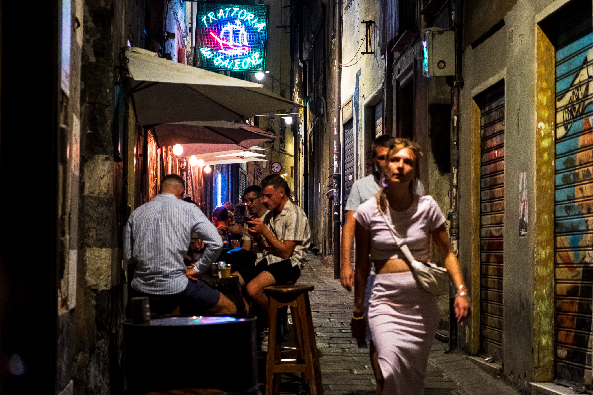
When I compare the two images, I find the original version has the better visual balance. Maybe, because in our western culture we are wired to read and look at things from left to right. The left side is colorful and bright, the main subject is looking from left to right, while the right side of the photograph is rather dark. In the mirrored version, the viewer’s eye starts with a dark area, moves against the gaze of the lady. Maybe this is what disturbs me.
The Significant Other, agreeing with my sentiments, also states that an unreadable sign as in the original version is less defocusing to the viewers eye than the “clear text” version in the second image, where the viewer might try to decipher the name of the Trattoria. Maybe another of a lot of little things that make me like the original version better, even if a lot of this is probably perceived subconscious. But maybe you totally disagree. I’d be interested to hear your views, please leave a comment below.
If you are looking for tips and inspirations around photography, make sure to visit my free Learning Center.
Have a great Sunday
Marcus
Related Posts:
Street Photography Quick Tip 5 – Composition – the hidden subject
Instant Inspiration (2) – Motion Blur
V1
Thanks, Marland, much appreciated! Marcus
V 1 for me, agree with your sentiments
Thanks, Sue, appreciate your thoughts! Marcus
Even though I am a reeducated left-hander, am not sure if this would apply to the eye movements. Nevertheless, I like the first version of the photo and appreciate your experiment.
Thanks, Bernd, I really appreciate your feedback! Marcus
The first image does if for me. Plus, I am fascinated by the man behind the woman on the left side of the photo–his left arm looks like it is attached to her body…which gives her a strange stance or even a third arm. I think that is a super catch, Marcus. The entire photo is pretty great. Lots to look at–my kind of photo.
Thanks, Lois, how great you saw the “third arm” thing. Yeah, its one one of those photos that I see and know its my shot of the day because so many things come together. Appreciate your feedback so much! Marcus
I thought about the sign a bit.
It seemed a little distracting at first.
But your image captures the scene “the way it was”
So, I guess (to most of me) it doesn’t need ‘fixing’
Thanks, Allan, appreciate your feedback. Actually I thought about cropping out the sign, but decided against it because with the neon lit window in the center and the reflection of the sign on the table I thought to better keep the “line of light”.
Great photo, Marcus, I prefer the bottom image, and a grayscale or BW version wouldn’t look right. It doesn’t have the right elements in it for those modes. It’s good to see you back again!
Thanks, John, appreciate your feedback and kind words! Marcus
You’re welcome, Marcus. 😎
Maybe you could also take the inverted sign on the second photo and superimpose it on the first?
Sure I could, and even thought about it, but its too much work 🙂 Thanks for sharing your thoughts, Hien!